ChainGraph Decorator Specification Reference
Table of Contents
- Introduction
- Node Decorators
- Property Decorators
- Scalar Port Decorators
- Complex Port Decorators
- Common UI Configuration Properties
- Port Type-Specific UI Properties
- Complete Examples
- Best Practices
Introduction
This document provides a comprehensive specification of all decorators available in the ChainGraph framework. It serves as the definitive reference for all decorator properties, types, and configuration options.
ChainGraph decorators are used to:
- Define nodes and their metadata
- Configure node properties as ports
- Specify port data types, validation rules, and UI behavior
- Create complex object schemas for structured data
How to Use This Reference
Each decorator section includes:
- Purpose: What the decorator is used for
- Target: What TypeScript elements it can be applied to
- Properties: Complete list of supported properties and their types
- Examples: Code snippets demonstrating proper usage
- UI Visualization: Where applicable, guidance on how properties affect visual representation
1. Node Decorators
@Node
Creates a node class that can be registered and used in ChainGraph flows.
Target: Class
Properties:
| Property | Type | Required | Default | Description |
|---|---|---|---|---|
| title | string | Yes | - | Display name of the node |
| description | string | No | - | Detailed description of the node's purpose |
| category | string | No | "other" | Category grouping for the node |
| icon | string | No | - | Icon identifier for node visualization |
| tags | string[] | No | [] | Keywords for node searchability |
| author | string | No | - | Author of the node |
| version | number | No | 1 | Node version number |
| ui | NodeUIMetadata | No | - | UI styling and positioning properties |
Example:
@Node({
  title: 'Message Creator',
  description: 'Creates a new message with the specified content',
  category: 'messaging',
  tags: ['message', 'create', 'content'],
})
export class CreateMessageNode extends BaseNode {
  // Node properties defined here
}NodeUIMetadata Properties:
| Property | Type | Description |
|---|---|---|
| position | { x: number, y: number } | Position in the canvas |
| dimensions | { width: number, height: number } | Node dimensions |
| style | { backgroundColor?: string, borderColor?: string } | Visual styling |
| state | { isSelected?: boolean, isHighlighted?: boolean, isDisabled?: boolean } | UI state |
2. Property Decorators
Direction Decorators
@Input
Marks a property as an input port.
Target: Property
Example:
@Input()
@String()
message: string = '';@Output
Marks a property as an output port.
Target: Property
Example:
@Output()
@String()
result: string = '';Port Metadata Decorators
These decorators add metadata to ports but don't affect their data types.
@Id
Sets a custom identifier for a port.
Target: Property Properties:
| Parameter | Type | Required | Description |
|---|---|---|---|
| portId | string | Yes | Custom ID for the port |
Example:
@Id('user_status')
@String()
status: string = 'active';@Name
Provides a custom name for a port.
Target: Property Properties:
| Parameter | Type | Required | Description |
|---|---|---|---|
| portName | string | Yes | Custom display name for the port |
Example:
@Name('User Message')
@String()
message: string = '';@Title
Sets a title for a port.
Target: Property Properties:
| Parameter | Type | Required | Description |
|---|---|---|---|
| title | string | Yes | Title text for the port |
Example:
@Title('Message Content')
@String()
content: string = '';@Description
Adds a description to a port.
Target: Property Properties:
| Parameter | Type | Required | Description |
|---|---|---|---|
| portDescription | string | Yes | Description text for the port |
Example:
@Description('Enter the message content to be sent')
@String()
content: string = '';@DefaultValue
Specifies a default value for a port.
Target: Property Properties:
| Parameter | Type | Required | Description |
|---|---|---|---|
| value | T | Yes | Default value for the port |
Example:
@DefaultValue('Hello World')
@String()
greeting?: string;@Metadata
Adds arbitrary metadata key/value pairs to a port.
Target: Property Properties:
| Parameter | Type | Required | Description |
|---|---|---|---|
| key | string | Yes | Metadata key |
| value | any | Yes | Metadata value |
Example:
@Metadata('ui:widget', 'status-indicator')
@String()
status: string = 'active';3. Scalar Port Decorators
@String
Defines a port with string data type.
Target: Property Properties:
| Property | Type | Required | Default | Description |
|---|---|---|---|---|
| defaultValue | string | No | '' | Default string value |
| minLength | number | No | - | Minimum string length |
| maxLength | number | No | - | Maximum string length |
| pattern | string | No | - | Regular expression pattern for validation |
| ui | StringPortConfigUIType | No | - | UI configuration options |
Example:
@Input()
@String({
  defaultValue: 'Hello World',
  minLength: 1,
  maxLength: 100,
  pattern: '^[A-Za-z ]+$'
})
greeting: string = 'Hello World'UI Configuration:
| Property | Type | Description |
|---|---|---|
| isTextArea | boolean | Render as multi-line text area |
| isPassword | boolean | Render as password field with masked input |
| textareaDimensions | { width?: number, height?: number } | Custom dimensions for textarea |
typescript | 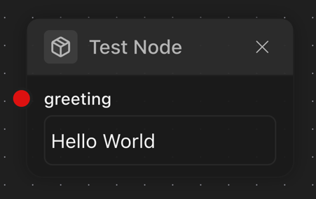 |
typescript | 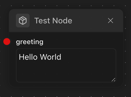 |
typescript | 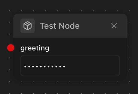 |
typescript |  |
typescript | 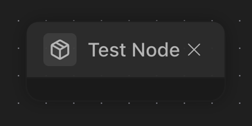 |
typescript | 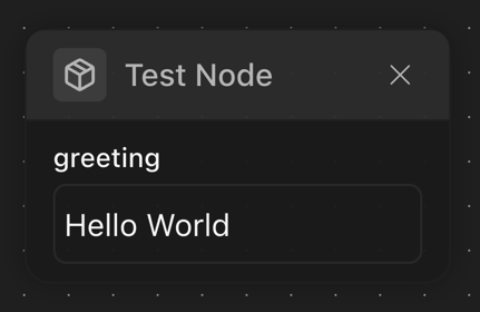 |
@Number
Defines a port with numeric data type.
Target: Property Properties:
| Property | Type | Required | Default | Description |
|---|---|---|---|---|
| defaultValue | number | No | 0 | Default numeric value |
| min | number | No | - | Minimum allowed value |
| max | number | No | - | Maximum allowed value |
| step | number | No | - | Step increment for UI controls |
| integer | boolean | No | false | Whether only integers are allowed |
| ui | NumberPortConfigUIType | No | - | UI configuration options |
Example:
@Input()
@Number({
  defaultValue: 42,
  min: 0,
  max: 100,
  step: 5,
  integer: true
})
quantity: number;UI Configuration:
| Property | Type | Description |
|---|---|---|
| isSlider | boolean | Render as slider control |
| leftSliderLabel | string | Label for minimum value of slider |
| rightSliderLabel | string | Label for maximum value of slider |
typescript | 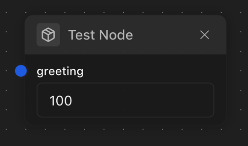 |
typescript | 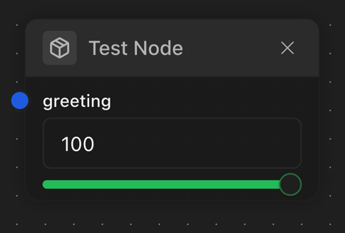 |
typescript | 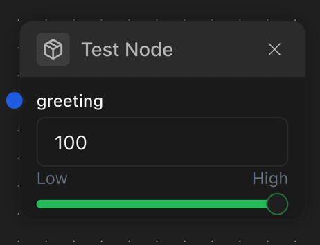 |
@Boolean
Defines a port with boolean data type.
Target: Property Properties:
| Property | Type | Required | Default | Description |
|---|---|---|---|---|
| defaultValue | boolean | No | false | Default boolean value |
| ui | BooleanPortConfigUIType | No | - | UI configuration options |
Example:
typescript | 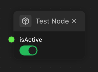 |
4. Complex Port Decorators
@PortObject & @ObjectSchema
The Object port system allows defining complex structured data objects.
@ObjectSchema
Marks a class as an object schema.
Target: Class Properties:
| Property | Type | Required | Default | Description |
|---|---|---|---|---|
| description | string | No | - | Schema description |
| category | string | No | - | Schema category |
| id | string | No | - | Custom identifier for the schema |
| type | string | No | [Class name] | Type identifier |
Example:
@ObjectSchema({
  description: 'User profile data structure'
})
class UserProfile {
  @String({ minLength: 2 })
  name: string = 'Anonymous'

  @Number({ min: 18 })
  age: number = 21
}@PortObject
Defines a port that accepts structured data.
Target: Property Properties:
| Property | Type | Required | Default | Description |
|---|---|---|---|---|
| schema | Class|IObjectSchema | Yes | - | Object schema definition |
| defaultValue | object | No | {} | Default object value |
| isSchemaMutable | boolean | No | false | Whether properties can be added/removed at runtime |
| ui | ObjectPortConfigUIType | No | - | UI configuration options |
Example:
@Input()
@PortObject({
  schema: UserProfile,
  defaultValue: new UserProfile(),
  isSchemaMutable: true
})
profile: UserProfile;UI Configuration:
| Property | Type | Description |
|---|---|---|
| addKeyFormHidden | boolean | Hide the "Add Key" form |
| collapsed | boolean | Whether the object collapsed in UI |
typescript | 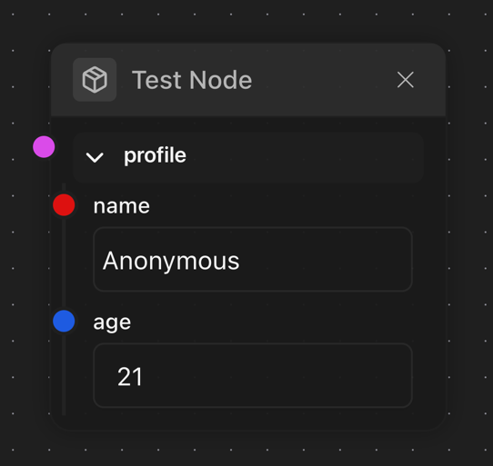 |
typescript | 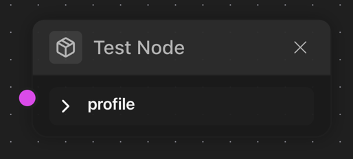 |
typescript | 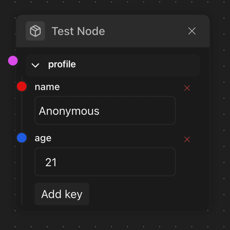 |
typescript | 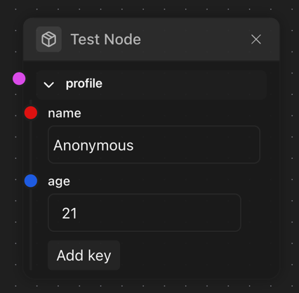 |
@PortArray & Array Helpers
@PortArray
Defines a port that accepts array data.
Target: Property Properties:
| Property | Type | Required | Default | Description |
|---|---|---|---|---|
| itemConfig | IPortConfig | Yes | - | Configuration for array items |
| defaultValue | array | No | [] | Default array value |
| minLength | number | No | - | Minimum array length |
| maxLength | number | No | - | Maximum array length |
| ui | ArrayPortConfigUIType | No | - | UI configuration options |
Example:
@Input()
@PortArray({
  itemConfig: { type: 'string', minLength: 1 },
  defaultValue: ['item1', 'item2'],
  minLength: 1,
  maxLength: 10
})
tags: string[];UI Configuration:
| Property | Type | Description |
|---|---|---|
| addItemFormHidden | boolean | Hide the "Add Item" form |
| itemDeletable | boolean | Allow deleting array items |
[UI SCREENSHOT PLACEHOLDER: Array port with items and add item button]
Array Helper Decorators
ChainGraph provides convenient helper decorators for common array types:
@PortArrayString
For string arrays.
Example:
@PortArrayString({ defaultValue: ['a', 'b'] })
tags: string[];@PortArrayNumber
For number arrays.
Example:
@PortArrayNumber({ defaultValue: [1, 2, 3] })
scores: number[];@PortArrayBoolean
For boolean arrays.
Example:
@PortArrayBoolean({ defaultValue: [true, false] })
flags: boolean[];@PortArrayObject
For arrays of objects.
Example:
@PortArrayObject(UserProfile, { defaultValue: [new UserProfile()] })
users: UserProfile[];@PortArrayNested
For multi-dimensional arrays.
Properties:
| Property | Type | Required | Description |
|---|---|---|---|
| depth | number | Yes | Number of nested array levels |
| itemConfig | IPortConfig | Yes | Configuration for innermost items |
| config | object | No | Additional array configuration |
Example:
@PortArrayNested(2, { type: 'number', defaultValue: 0 })
matrix: number[][];@PortEnum & Enum Helpers
Enum ports allow selecting from a predefined set of options.
@PortEnum
Target: Property Properties:
| Property | Type | Required | Default | Description |
|---|---|---|---|---|
| options | IPortConfig[] | Yes | - | Array of option configurations |
| defaultValue | string | No | - | Default selected option ID |
| ui | EnumPortConfigUIType | No | - | UI configuration options |
Example:
typescript | 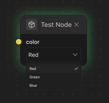 |
Enum Helper Decorators
@StringEnum
For string-based enums.
Example:
@StringEnum(['Red', 'Green', 'Blue'], { defaultValue: 'Red' })
color: string;@NumberEnum
For number-based enums.
Example:
@NumberEnum([1, 2, 3], { defaultValue: '1' })
level: number;@PortEnumFromObject
Creates an enum from an object mapping.
Example:
const statusOptions = {
  active: new UserStatus('Active'),
  inactive: new UserStatus('Inactive'),
  pending: new UserStatus('Pending'),
};

@PortEnumFromObject(statusOptions, { defaultValue: 'active' })
status: keyof typeof statusOptions;@PortEnumFromNative
Creates an enum from a native TypeScript enum.
Example:
enum Direction {
  Up = 'Up',
  Down = 'Down',
  Left = 'Left',
  Right = 'Right',
}

@PortEnumFromNative(Direction, { defaultValue: Direction.Up })
direction: Direction;@PortStream
Defines a port that handles continuous data streams using the MultiChannel implementation.
Target: Property Properties:
| Property | Type | Required | Default | Description |
|---|---|---|---|---|
| itemConfig | IPortConfig | Yes | - | Configuration for stream items |
| defaultValue | MultiChannel | No | - | Default stream channel |
| ui | StreamPortConfigUIType | No | - | UI configuration options |
Example:
@Input()
@PortStream({
  itemConfig: { type: 'string', minLength: 1 }
})
inputStream: MultiChannel<string> = new MultiChannel<string>();@PortAny
Defines a port that can accept any type of value, with optional type validation through an underlying type.
Target: Property Properties:
| Property | Type | Required | Default | Description |
|---|---|---|---|---|
| underlyingType | IPortConfig | No | - | Optional configuration for value validation |
| defaultValue | any | No | null | Default value |
| ui | BasePortConfigUIType | No | - | UI configuration options |
Example:
@Input()
@PortAny({
  underlyingType: { type: 'string', minLength: 1 },
  defaultValue: 'default'
})
dynamicInput: any;5. Common UI Configuration Properties
All port types support a common set of UI configuration properties through the ui parameter:
| Property | Type | Applicable To | Description |
|---|---|---|---|
| hidden | boolean | All ports | Hide the port entirely |
| disabled | boolean | All ports | Disable user interaction with the port |
| hideEditor | boolean | All ports | Hide the editor while showing the port connection point |
| hidePort | boolean | All ports | Hide the port from the node display |
| bgColor | string | All ports | Background color for the port handle (hex or CSS color) |
| borderColor | string | All ports | Border color for the port handle (hex or CSS color) |
Example:
@String({
  ui: {
    bgColor: '#e70d0d',
    borderColor: '#460707',
    disabled: false,
    hideEditor: false
  }
})6. Port Type-Specific UI Properties
String Port UI
| Property | Type | Description |
|---|---|---|
| isTextArea | boolean | Render as multi-line text area instead of single-line input |
| isPassword | boolean | Render as password field with masked input |
| textareaDimensions | { width?: number, height?: number } | Custom dimensions for textarea |
Number Port UI
| Property | Type | Description |
|---|---|---|
| isSlider | boolean | Render as slider control instead of number input |
| leftSliderLabel | string | Label for minimum value of slider |
| rightSliderLabel | string | Label for maximum value of slider |
Array Port UI
| Property | Type | Description |
|---|---|---|
| addItemFormHidden | boolean | Hide the "Add Item" form |
| itemDeletable | boolean | Whether array items can be deleted |
| allowedTypes | PortType[] | Types allowed when adding new items |
Object Port UI
| Property | Type | Description |
|---|---|---|
| keyDeletable | boolean | Whether object properties can be deleted |
| collapsed | boolean | Whether the object port collapsed |
| hidePropertyEditor | boolean | Whether object properties can be edited |
| allowedTypes | PortType[] | Types allowed when adding new properties |
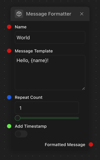
7. Complete Examples
Basic Node with Scalar Ports
import type { ExecutionContext, NodeExecutionResult } from '@badaitech/chaingraph-types'
import {
  BaseNode,
  Boolean,
  Input,
  Node,
  Number,
  ObjectSchema,
  Output,
  String,
} from '@badaitech/chaingraph-types'
import { NODE_CATEGORIES } from '../categories'

@Node({
  title: 'Message Formatter',
  description: 'Formats a message with parameters',
  category: NODE_CATEGORIES.DATA,
  tags: ['formatting', 'text', 'message'],
})
class MessageFormatterNode extends BaseNode {
  @Input()
  @String({
    title: 'Message Template',
    description: 'Template with {placeholder} markers',
    defaultValue: 'Hello, {name}!',
    minLength: 1,
    ui: {
      isTextArea: true,
      textareaDimensions: { width: 200, height: 100 },
    }
  })
  template: string = 'Hello, {name}!'

  @Input()
  @String({
    title: 'Name',
    description: 'Name to insert in the template',
    defaultValue: 'World',
  })
  name: string = 'World'

  @Input()
  @Number({
    title: 'Repeat Count',
    description: 'Number of times to repeat the message',
    defaultValue: 1,
    min: 1,
    max: 10,
    integer: true,
    ui: {
      isSlider: true,
    }
  })
  repeatCount: number = 1

  @Input()
  @Boolean({
    title: 'Add Timestamp',
    description: 'Whether to add a timestamp to the message',
    defaultValue: false,
  })
  addTimestamp: boolean = false

  @Output()
  @String({
    title: 'Formatted Message',
    description: 'The resulting formatted message',
  })
  output: string = ''

  async execute(context: ExecutionContext): Promise<NodeExecutionResult> {
    let message = this.template.replace('{name}', this.name)

    if (this.addTimestamp) {
      message = `${message} [${new Date().toISOString()}]`
    }

    this.output = message.repeat(this.repeatCount)

    return {}
  }
}
8. Best Practices
Organization of Decorators
When applying multiple decorators to a property, follow this order for maximum readability:
- Direction decorators (
@Input,@Output) - Metadata decorators (
@Title,@Description) - Type decorators (
@String,@Number, etc.)
@Input()
@Title('User Message')
@Description('Enter the message to be processed')
@String({
  minLength: 1,
  maxLength: 1000,
  ui: {
    isTextArea: true
  }
})
message: string = '';Object Schema Definitions
Define object schemas as separate classes rather than inline objects for better reusability and type safety:
// Good practice:
@ObjectSchema()
class UserProfile {
  @String()
  name: string = '';

  @Number()
  age: number = 0;
}

@Input()
@PortObject({ schema: UserProfile })
user: UserProfile;

// Avoid:
@Input()
@PortObject({
  schema: {
    properties: {
      name: { type: 'string' },
      age: { type: 'number' }
    }
  }
})
user: any;Default Values
Always provide sensible default values, either in decorator configurations or as property initializers:
// In decorator:
@String({ defaultValue: 'Default text' })
message?: string

// Or as property initializer:
@String()
message: string = 'Default text';This specification document provides a comprehensive reference for all ChainGraph decorators and their configuration options. Use this as your guide when creating nodes, ports, and object schemas in your ChainGraph applications.